Monthly Archives: March 2011

Update: progress in class today

Not much to report for today. Printed my resized version of the six-pack, and it seems to fit the bottles well. (I found out I even have extra space in the center that can hold a seventh bottle!)

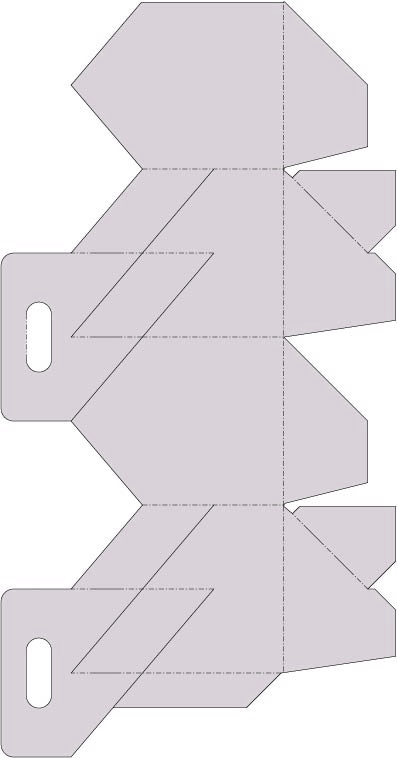
I don’t have a photo of the correct size, since I didn’t have glue or tape and was basically holding the pieces together while I placed the bottles inside. But here’s a shot of the final template (same as what I posted on Monday):

I realize I haven’t gotten very far with this portion of the project yet. Our capstone is having its first pin-up tomorrow, so I’ve been pouring all my free time into getting the spreads ready for that. After tomorrow at noon, though, I can devote some time to this project and hopefully make good progress over the weekend.


Container specs

My main focus today was on the size specifications for my container. First I measured a beer bottle (I used the Bud Light bottles in Carnegie that were someone’s project last year). The bottles are 9.5″ tall, 2.5″ diameter, 7.75″ circumference base, and 4.75″ circumference neck.

After building the hexagonal crate to what I thought were the correct dimensions to fit the bottles, I found out that the template in the book is much too wide for a beer bottle. So I had to rework the template, which was difficult to do since the file is an .eps and doesn’t allow for resizing parts of the whole. I had to cut and paste the hexagon pieces for the top and bottom, then resize everything so that each of the 6 sides measures 9.75″x3.9″. This took forever, but here is what the final template looks like:

I will assemble it at some point to make sure it fits all the bottles, but from here I plan to actually start designing it, as well as reworking the bottle labels I created before. I’m also considering barmats (coasters), tappers and glasses if time allows.


Visual Brief

Here’s the visual brief for my brand identity:


Competitive Audit: beer packaging designs

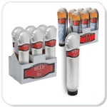
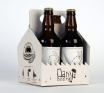
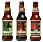
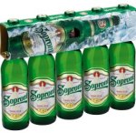
After looking over so many unique designs, I’ve decided to scrap the traditional six pack for something that reflects my brand. Here’s some of the competition:

I think I’m going to go for a radial form by using a hexagonal six-pack (from a template found in one of Hilary’s books). It will allude to the radial shape of a rose, and give the product a unique shape that will be immediately recognizable on a store shelf. It also incorporates die-cut windows so consumers can see the bottle labels inside.


Packaging: day two

I found a six pack box at a friend’s house last night, and after asking them if I could have it (they gave me a funny look but consented) I took it home and tore it apart. I didn’t realize how many time those things fold in on themselves to retain their sturdiness! Plus they use a ton of glue to hold it all together.

After doing a competitive audit today, I found there are many more creative ways to package beer bottles than the typical cardboard 3×2 six pack design. (See my blog post above for the examples I found for my audit.) So I went through the packaging books again, this time keeping an eye out for anything that could hold a few bottles. I found several boxes that I could cut holes in for the longnecks, as well as a longneck holder that would act as a divider inside of a box. However, I also came across another design that I think will work perfectly.

It’s a hexagonal six-pack case, which means the bottles would all fit in together while forming a radial shape that I’ve been exploring in other parts of my design. The hexagon will still resemble a rose shape, and die cuts on the side will allow the labels to show through near the bottom.

My next task is to figure out the correct size for the box. This will mean buying a large sheet of cardboard (preferably waterproof) that will be big enough to fold into the right size. Which means probably not going to fit in the printer. So I’m going to test the effects of a wintergreen transfer on the cardboard (possibly making it look something like the New Glarus box above), or printing off separate panels and gluing them onto each wall.


Packaging design

THIS IS FROM http://www.thepadrino.com/2010/03/square-coke-bottle.html — NOT ME.

The Square Coke Bottle

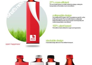
It seems coke is unraveling a new concept that’s a little square.This bottle is made of 100% Recycled sugar cane byproducts.The bottle you see here is more collapsable than the current one though, encouraging more recycling due to ease in transport. The bottle collapses 66% smaller than its original size. You’re much more likely to hold on to a bottle for later recycling if you can carry it in your pocket.The cap is 25% slimmer than the current 20oz bottle, and 27% more efficient because of its drastically reduced footprint.The design is by CCS student Andrew Kim


Read more: The Padrino: The Square Coke Bottle http://www.thepadrino.com/2010/03/square-coke-bottle.html#ixzz1HRqBlZVD
Source


Packaging ideas

I focused mainly on the six-pack design for my bottles today. The only bottle carrier I could find in the books holds four bottles, so I think I’m going to have to find a template for six somewhere else. I looked online, but templates are surprisingly hard to find. I think I’m going to just find a six-pack case somewhere and break it down, then trace the flattened cardboard to the dimensions I need.

I was also wondering how to print my design onto a cardboard box. A previous student made a case for energy drinks with a six-pack, but she just glued paper onto an already existing box. I want to create my own, possibly with different size walls or die cuts to highlight my logo. I’ll look for light but sturdy cardstock that will still run through the printer, or consider wintergreen oil transfers if I can’t do that. I’ll have to experiment with some sizes, and talk to Prof. Fender about the printer’s capabilities.

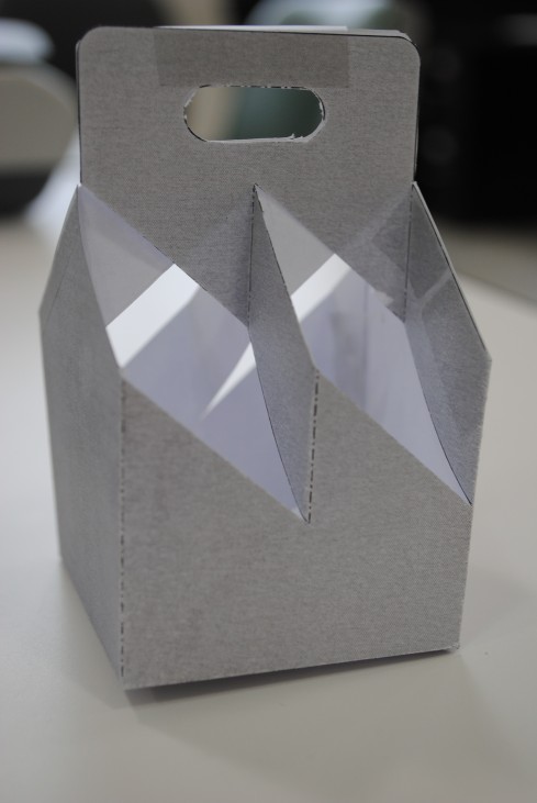
For now, here’s the box I assembled based on the four-pack template:


Concept Narrative: Identity Design

For my final identity design materials, I chose the solid black logo and Trade Gothic, a clean sans-serif font with a wide variety of typefaces to choose from. My background went from cold granite to a warm, light wood planking. I feel like the wood texture warms up the heavy black ink, while the light oak-colored planks contrast better than a darker wood (i.e. cherry or mahogany). The wood also gives it a sense of masculinity that will translate well with my business’ clientele, since my targeted demographic are blue-collar/working class men, specifically in the New England area.

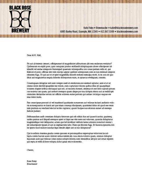
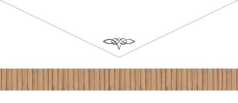
My business card and letterhead incorporate a bar of transparency oversetting the wood. This makes the black pop from the brown wood, and prevents the smaller type from getting lost in the grooves between the planks. My envelope mimics the letterhead with a horizontal band of vertical planking along the bottom. Though the bands of wood on the stationary are horizontal, I used vertical planks to simulate the verticality of the logo, business cards, and later the bottles and other branding materials I will create in project 3.

Again, this is my logo:

Here is my final business card:

My stationary:

Letterhead

Front of envelope


Back of envelope

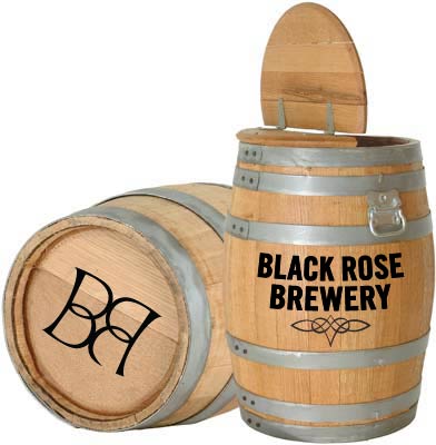
And my signage (both keg and brewery gate):


Brewery gate

Brewery keg


Progress & changes to logo

So, based on the feedback I received from class last Wednesday, I’ve decided to make a few changes to my design. For one, I changed the background texture from granite to a light wood. I like the warmth the wood gives to the black, and it doesn’t require any other colors to accent a simple black and white image. I think I’m going to use primarily burgundy if something calls for another color; I think it works better than the blue or green.

I switched out the Helvetica Inserat for Trade Gothic, since it has more typefaces to choose from while still maintaining the thick sans serif I’m looking for. I upped the thickness with a one-point stroke, and used all caps to make it feel a little heavier. I think the combined weight gives it the right amount of heft that I’m looking for with the logo.

I also added another element to my signage materials. I had played with bottle labels and a keg for some variety of sizes, but I felt I need to go bigger still to get the full effect. So I found a photo of the St. James Gate entrance to the Guinness brewhouse in Dublin (the gate is an iconic part of the brewery) and transposed a light wood planking on top of the black gate. Then I added my logo to the gate, as well as some decorative hinges (since I didn’t put the Celtic knot on the gate, I figured some wrought iron hinges would suggest the flourish instead).

(I’ve also started designing letterhead, but I haven’t gotten very far with that, so I’ll wait until Wednesday to post those.)


JPGs: Business cards + Signage