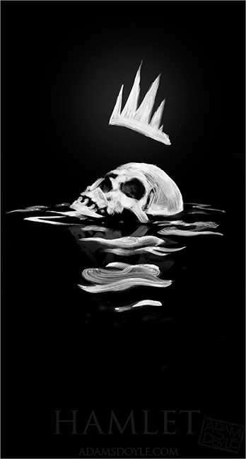
Here are two examples I found of other Hamlet posters. The first one I think is very similar to the style we want to pursue: minimalist, dark and even a little smoky. The second is in a style we want to avoid: a collage of many different elements in the film, but none of which hold much symbolism of the overall message.
Category Archives: Show + Tell
Packaging design
THIS IS FROM http://www.thepadrino.com/2010/03/square-coke-bottle.html — NOT ME.
The Square Coke Bottle
Read more: The Padrino: The Square Coke Bottle http://www.thepadrino.com/2010/03/square-coke-bottle.html#ixzz1HRqBlZVD
Source
Project Two: Subject and competitive audit
For project two, I’ve decided to create my brand identity design around a microbrewery. For this, I wanted to do a sort of New England/Boston/Irish style design, but am having a hard time finding an entity that really exemplifies what I want to do.
At first I had this amazing idea (or so I thought) to create a coat of arms with barley, hops, water and malt symbols in the crest. However, upon browsing tonight I found out that a small brewery in Vancouver called Okanagan Spring did the exact same thing! Now, I’ve never even heard of them, much less seen their label, but it’s always really annoying to see that someone had your great idea first.
So, despite that setback, here is a list of 10 breweries with good logos (for my competitive audit):
- Flying Dog Brewery (featuring artwork by Ralph Steadman! <3)
- San Francisco Brewery
- Shiner Beers
- Killian’s Irish Ale
- Peacetree Brewing Co.
- Murphy’s Irish Stout
- Rogue Ales
- Smithwick’s
- New Belgium Brewery
- Strongbow Cider
While none of these have exactly what I want to do (which is good), many of them incorporate design aspects I might include (and some just look really cool).
Also, Fullsteam Brewery has an awesome identity package, which I’ve chosen for my Show + Tell piece for the assignment.
Trail map example
I chose a map that highlighted ATV/Jeep trails. The main attraction to this was the bold colors and relative readability of the map. The trails are highlighted in bright colors oversetting a normal road map. The different trails are divided by color and number into areas, with an easy-to-read key to the right of the map.
My first glance at this map was very quick, but in that time I had already understood the main points of it, which I think is important to good information design. Map readers want something they can look at quickly without having to analyze it, and I think this example does a great job at giving a lot of info with a short amount of time and effort.


